Two Bridges muay thaiRedesigning a gym’s website with a focus on responsive design and improving information architecture to boost discoverability
MY ROLE
UX Researcher
UX / UI Designer
Visual Designer
TOOLS
Figma
Google forms
DURATION
2 months
The process
1. UNDERSTAND
BACKGROUND
Two Bridges Muay Thai is a martial arts gym in Manhattan's Lower East Side (LES) that gained popularity by offering outdoor classes during the height of the COVID-19 pandemic in 2020, keeping New Yorkers active. The popularity of outdoor classes led to a permanent indoor location and a thriving membership community.
PROBLEM
At a glance, the website’s navigation titles lack clarity (Book class?, Prices, First time?, Contact us). This makes it difficult for users to understand the information offered on each page. While the website has all the key information a user might want to know about the gym, a more effective presentation could optimize the user experience.
SOLUTION
Redesign the Two Bridges Muay Thai website with a focus on responsive design and user-friendly information architecture. The goal is to enable users on any device to effortlessly find key information, eliminating guesswork.
2. USER RESEARCH
CONDUCTING AN AUDIT DURING USER INTERVIEWS
I recruited 5 participants between the ages of 23-37 for the user interviews. In addition to asking participants a series of questions, I conducted a lightweight user testing to audit the original website. To explore potential areas of confusion on the website, I assigned participants three tasks to test these hypothesized problem areas:
Browse class schedule
Book a class
Find the FAQ
Observing user behavior during the audit
Audit finding #1: The audit validated my hypothesis that the FAQ content was hard to find. Several participants overlooked the FAQ section entirely because it was buried at the bottom of the “First time?” page.
Audit finding #2: User testing revealed that there was no distinct pattern in user behavior for website navigation. Some participants explored the full landing page before engaging with other pages, while others opted to go directly to the
pricing page.
Audit finding #3: There are two entry points to access browsing & booking a class — Landing page or ‘Book class’ page from the navigation bar. When tasked to browse & book a class, there was no distinct pattern in user behavior. Some participants opted to view the schedule directly from the landing page, while others viewed it from the ‘Book class’ page.
Overall, participants succesfully completed 2 out of 3 tasks. While the website met essential user needs, participants found it lacks visual appeal, suggesting an opportunity to improve the visual design.
3. DEFINE THE PROBLEM SPACE
SYNTHESIZING RESEARCH FINDINGS
An affinity map was created to further synthesize the research findings, revealing three key user pain points that could elevate
the website:
Research revealed three particular areas of improvement for the website —
(1) Redesign the information architecture to improve clarity (2) stronger brand identity and (3) information about the gym and coaches.
PROBLEM STATEMENT
I wrote 2 point of view (POV) statements and 4 how might we (HMW) statements, and narrowed down the problem space further:
Point of view: I’d like to explore ways to make the Two Bridges Muay Thai website more appealing by improving the visual design and making key information accessible.
How might we:
…streamline the website so that the most important content is shown first?
…improve the content design and reduce the number of clicks for users to get the information they need?
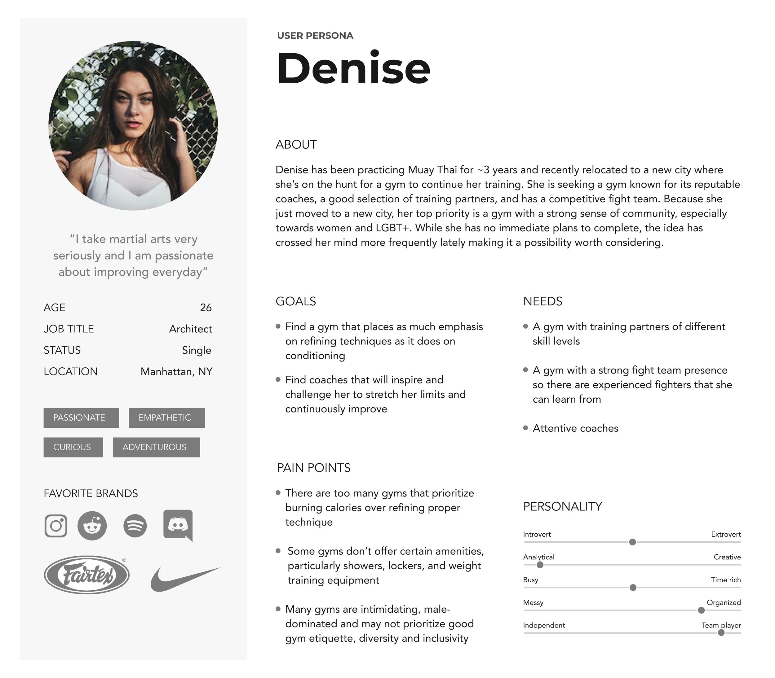
USER PERSONA
The user persona portrays an deeply passionate intermediate level Muay Thai practitioner. Seeking more challenge in her practice, Denise explores the possibility of competitive fighting to test her skills against an opponent in the ring.
4. IDEATE
FEATURE ROADMAP
The feature roadmap was based on the needs of the user persona and interview insights. All features were categorized from P1 - P4.
With only 80 hours set aside for this project, I prioritized features marked as P1-P2.
To revamp:
Class schedule view: Currently, users can only view the schedule by day. Adding different calendar views, such as a weekly calendar view will minimize scrolling and improve user memorability. [P1 - Must have]
FAQ: Currently, the FAQ is at the very bottom of the ‘First time?’ page. Creating a dedicated FAQ page will reduce the number of clicks needed to reach this content, making it much easier to find at a glance [P1 - Must have]
Visual design: Currently, the website lacks a distinct color palette and no clear font size hierarchy. Using variations of the existing colors and introducing accent colors will enhance the visual design. Changing the font sizes will give the typeface a clear visual hierarchy to differentiate the headers from body text. [P1 - Must have]
About us: Currently, there is about us content in the landing page below the Hero section and under ‘First time?’ page which is not easy to find. My goal is to consolidate this text and add new content that pertains to the gym’s background and story. [P1 - Must have]
To add:
Coach profiles [P1 - Must have]
Amenities [P1 - Must have]
Events & social calendar [P2 - Nice to have]
5. DESIGN
I examined websites from 13 well established competitor Muay Thai gyms and drew inspiration from websites that had a strong visual identity and a compelling background and mission statement. By exploring other Muay Thai gym websites, I gained valuable insights into structuring information effectively and user-friendly naming conventions for the navigation bar.
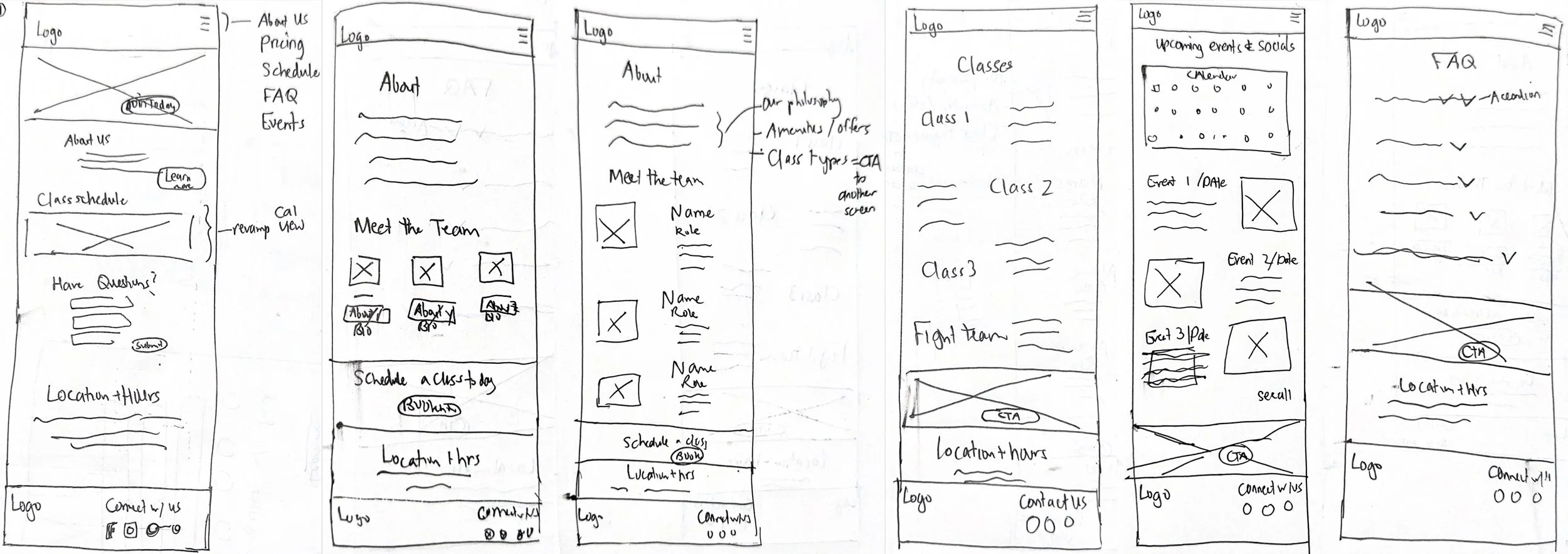
LOW FIDELITY WIREFRAMES
I chose a mobile-first approach to redesign the website, creating six total screens for low fidelity — Landing page, About, Classes, Events, and FAQ.
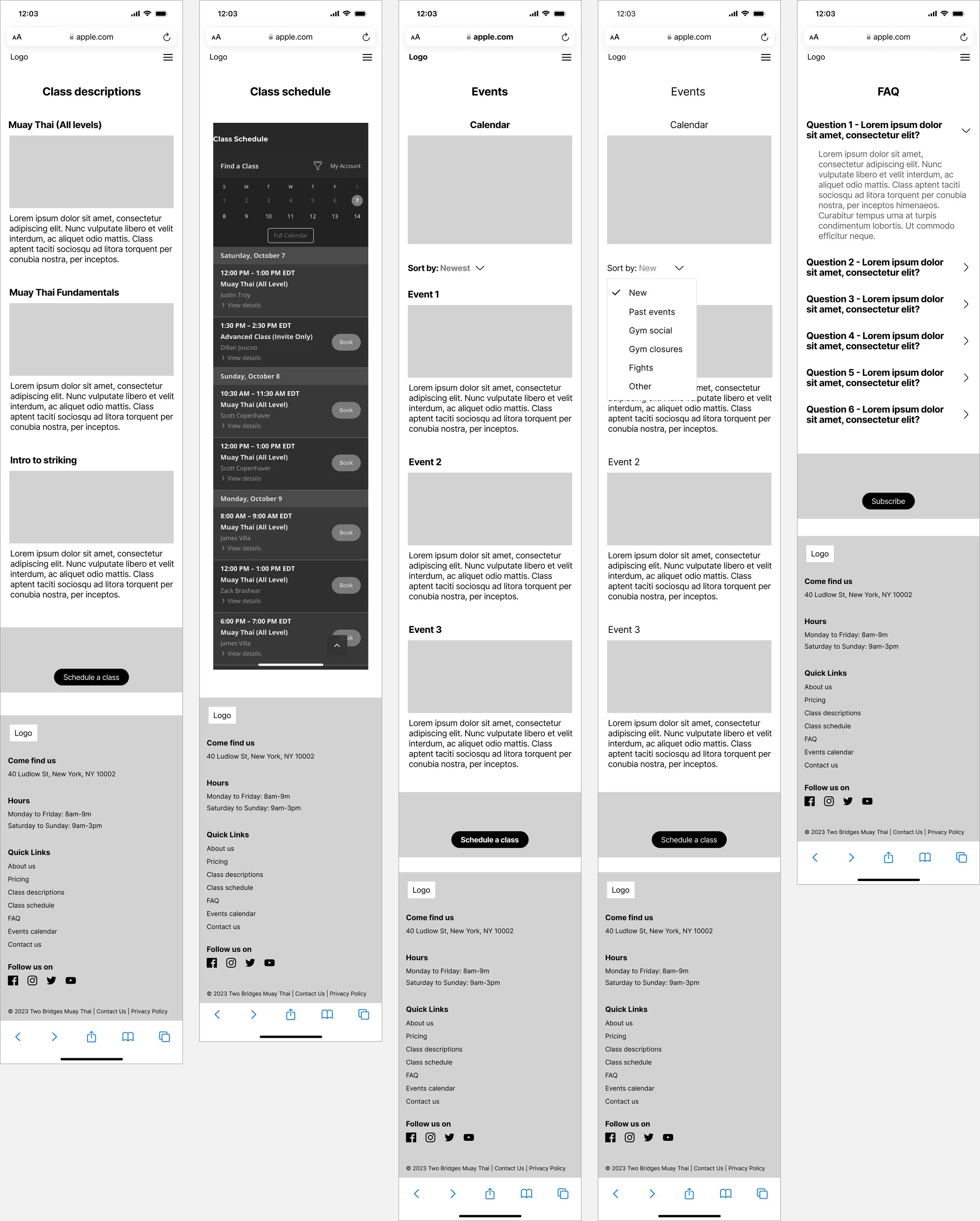
MID FIDELITY WIREFRAMES
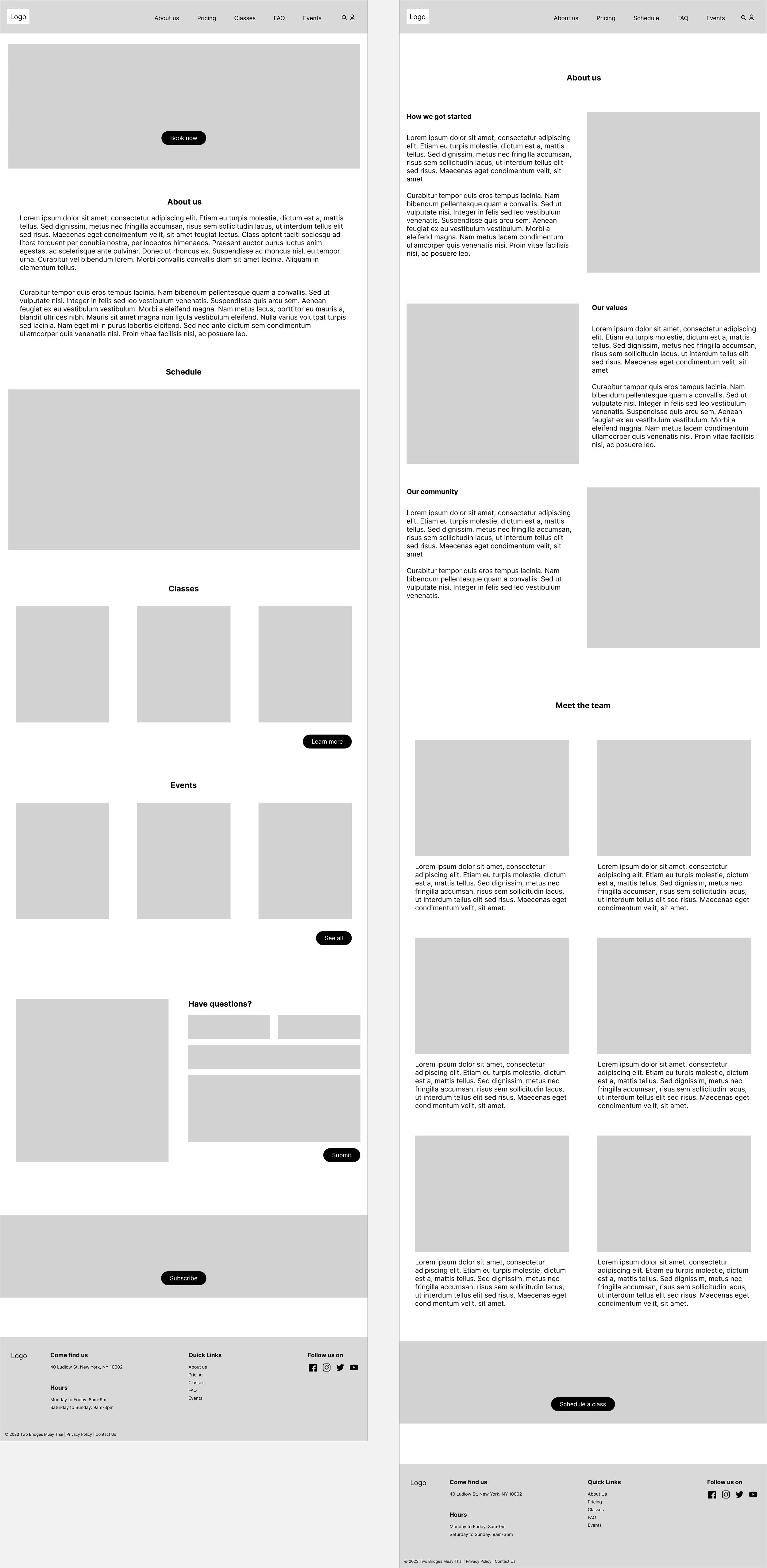
Building off the low fidelity wireframes, I created 6 additional screens to provide a more comprehensive view of the interactions. I also created desktop versions for each screen, ensuring a responsive design across mobile and desktop.
Mobile
Desktop
MID FIDELITY USABILITY TESTING & ITERATIONS
I conducted usability testing with 2 participants that have 3-5 years of Muay Thai experience. The purpose of introducing usability testing at this stage is to pinpoint major flow issues and focus on the interactions without distraction of the content. Conducting mid fidelity testing also helped me catch issues early on, saving me time down the line.
Feedback from participants was overall positive with no major flow issues. Based on feedback, I made two iterations:
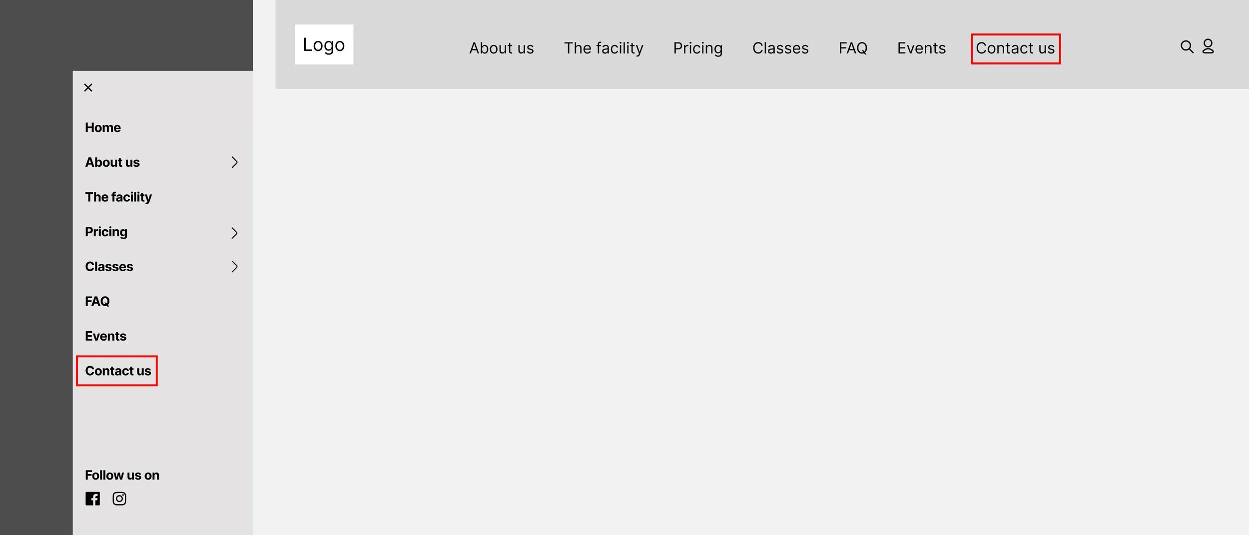
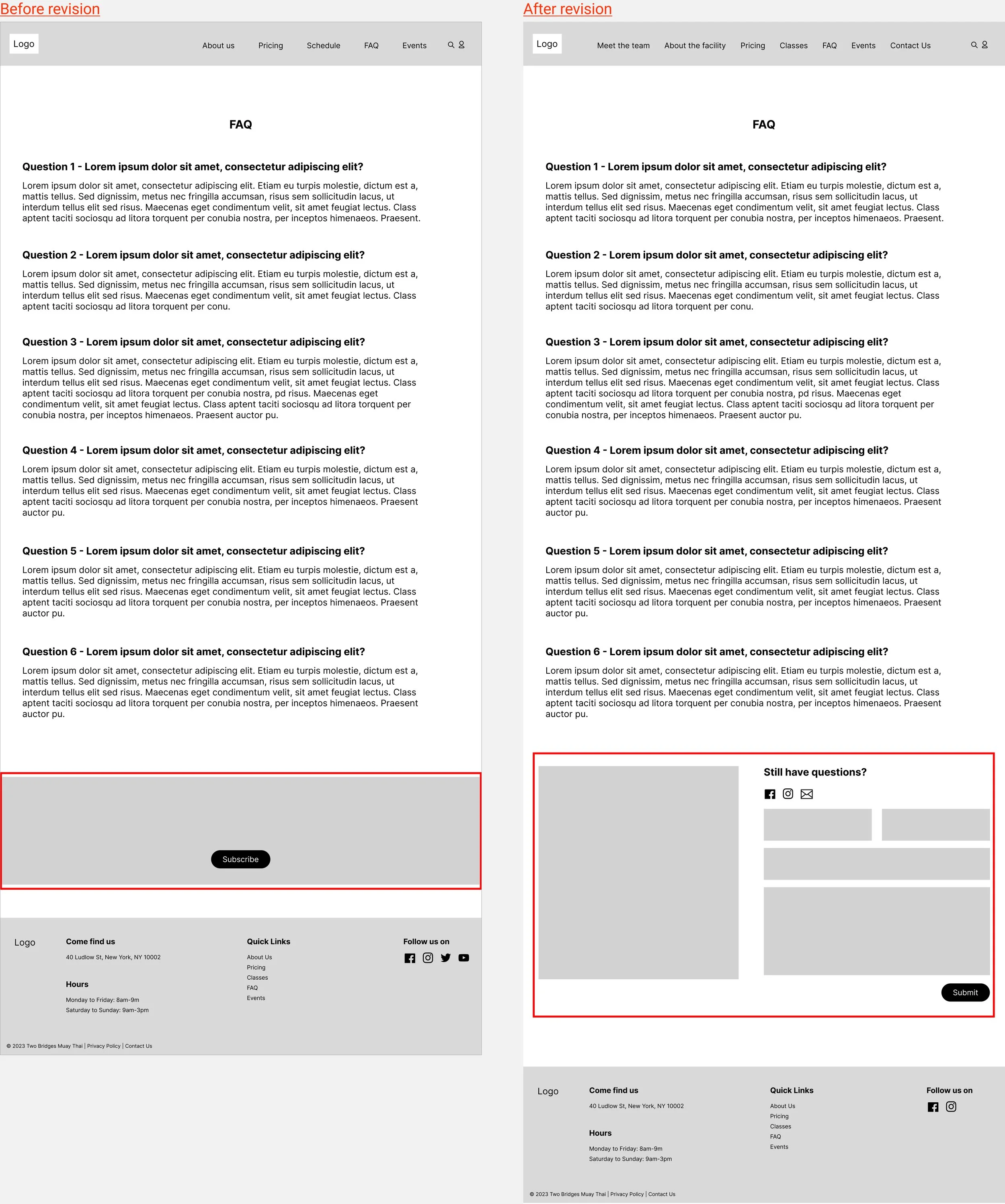
1. Make the "Contact Us" CTA more readily available throughout the website
2. Optimize the ‘About Us’ content
Mid fidelity testing revealed that participants valued coach background and amenities more than the gym’s background. To refine the 'About Us' content structure, I created several design variations incorporating the additional content. I conducted A/B testing with three participants (introducing 1 new participant from a previous project) to determine which variation to bring up to high-fidelity. The final variation adopts a variation of the two options and can be viewed in the high fidelity wireframes (click here to view high-fidelity wireframes).
STYLE TILE
For the look and feel, my main focus was to refine the typeface and color palette without deviating from the existing colors
and fonts:
Colors: I applied variations of red/blue colors from the original website and introduced accents of green and magenta. These additional colors were inspired by the gym's in-store apparel. For these colors, my goal was to evoke a feeling of 90s nostalgia, reminiscent of Marvel and Capcom’s Street Fighter video games.
Typeface: I used the same typefaces from the original website but adjusted the font sizes to create a visual hierarchy between header and body text.
Logo: Enlarged the logo to improve readability, as the original website's logo was too small
HIGH FIDELITY WIREFRAMES
For high fidelity wireframes, I used a combination of stock photos and images from the original website and brought in the colors and font size adjustments from my style tile.
Mobile
Desktop
6. TEST
I conducted usability testing with 5 participants from ages 32-37 (4 new recruits that are unfamiliar with Muay Thai; 1 participant from mid-fidelity testing).
Overall, participants encountered few issues with the website, with most feedback reflecting personal preferences. When asked to rate their experience using the redesigned website, participants gave an average rating of 2-3 (Note: 1 - easy, 10 - challenging).
Organizing feedback into a feedback grid was a valuable exercise to identify major themes of feedback:
Landing Page: Declutter the landing page to reduce scrolling and highlight most important content
About Us: Find the appropriate place on the website for the About us content
Classes: Opportunity to improve the layout of the class calendar and class details page
Events: Add option to filter events and visual indicators on the calendar to highlight days that have scheduled events
7. ITERATE
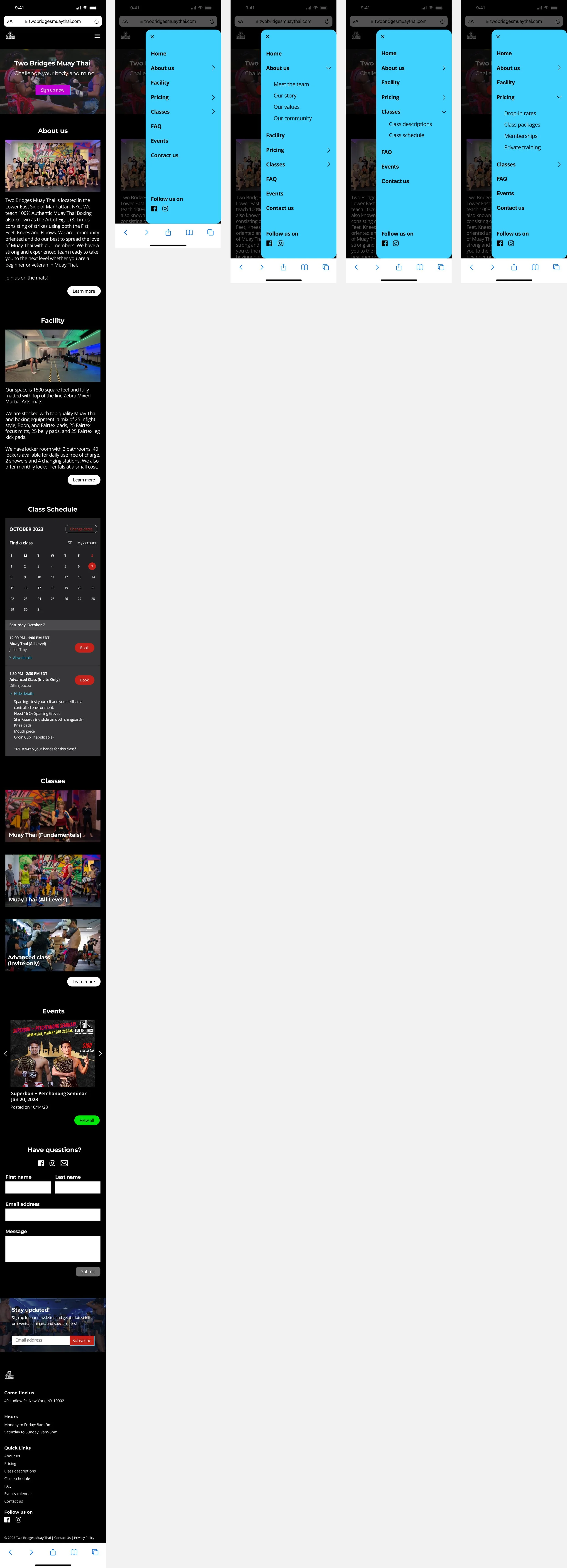
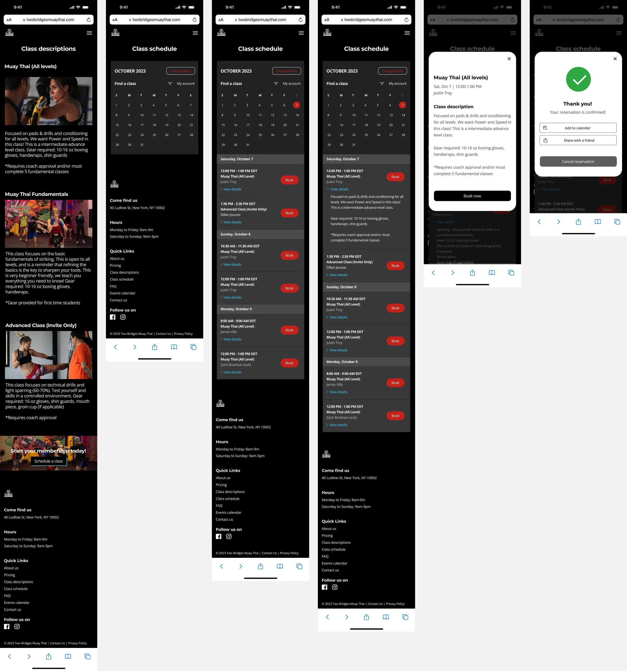
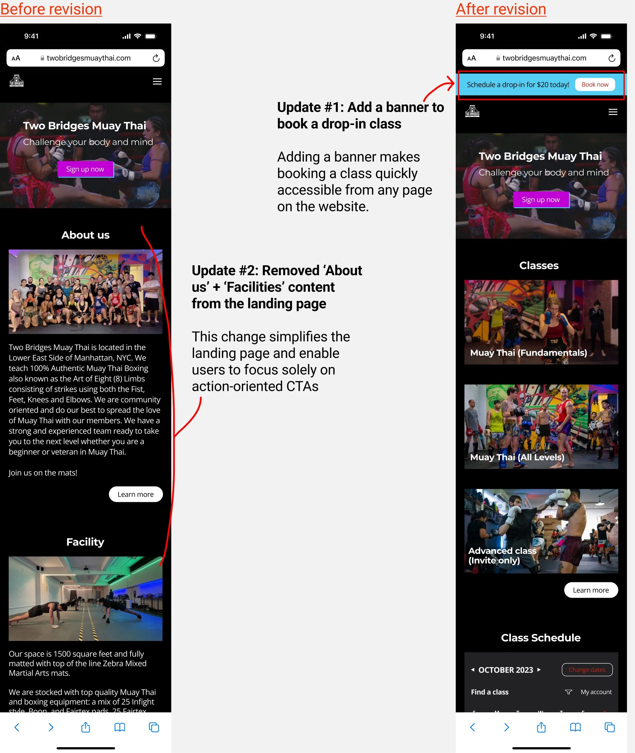
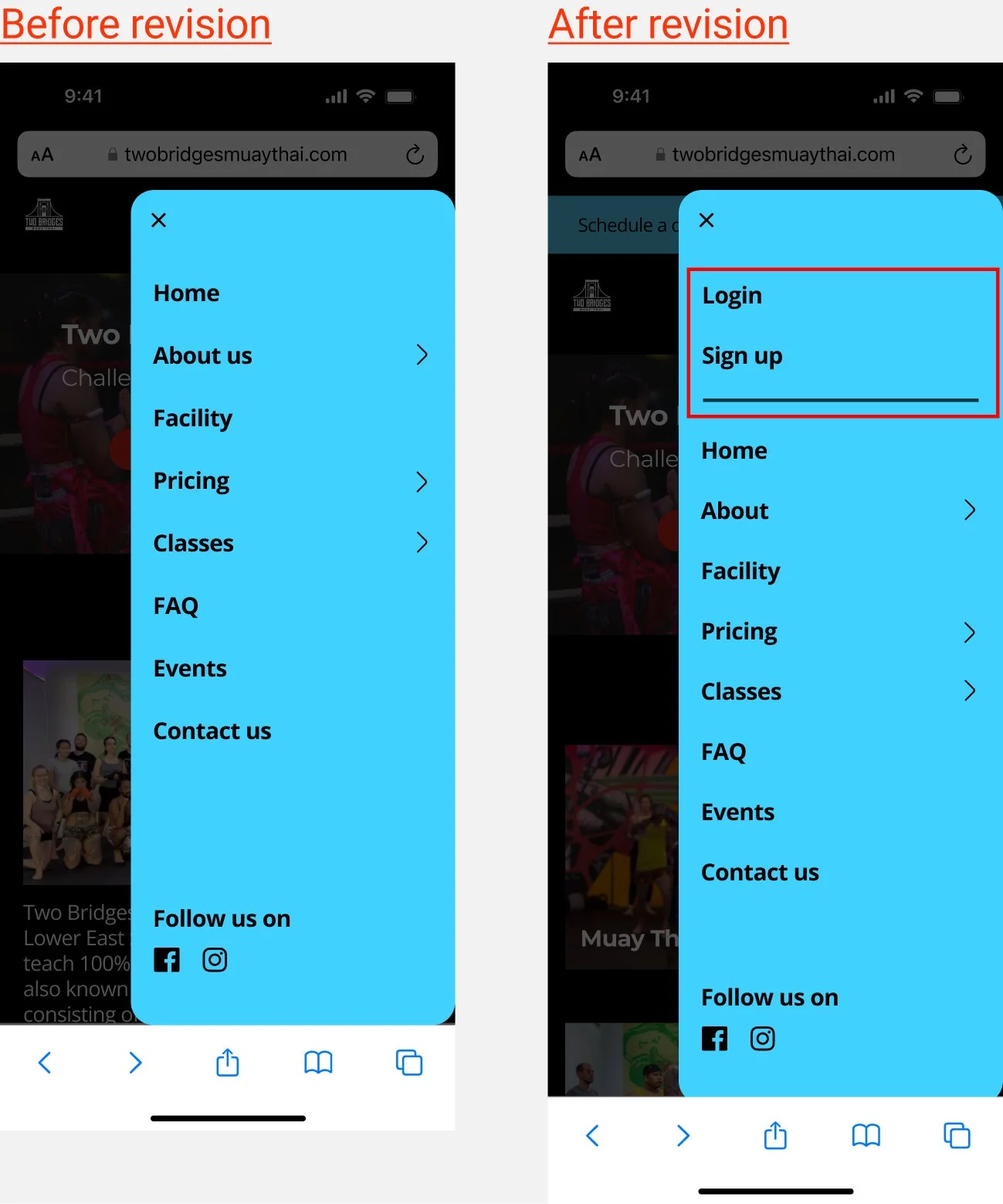
Usability testing uncovered minor issues in UI and information architecture. I polish up the interface and enhance the information architecture. This section highlights a selection of revisions for the mobile version. The same changes have been applied to desktop unless noted otherwise.
1. Landing page
2. Events screen
3. Hamburger menu (mobile revision only)
4. Booked class confirmation screen
FINAL VERSION
A COMPARISON OF THE ORIGINAL WEBSITE AND REDESIGN
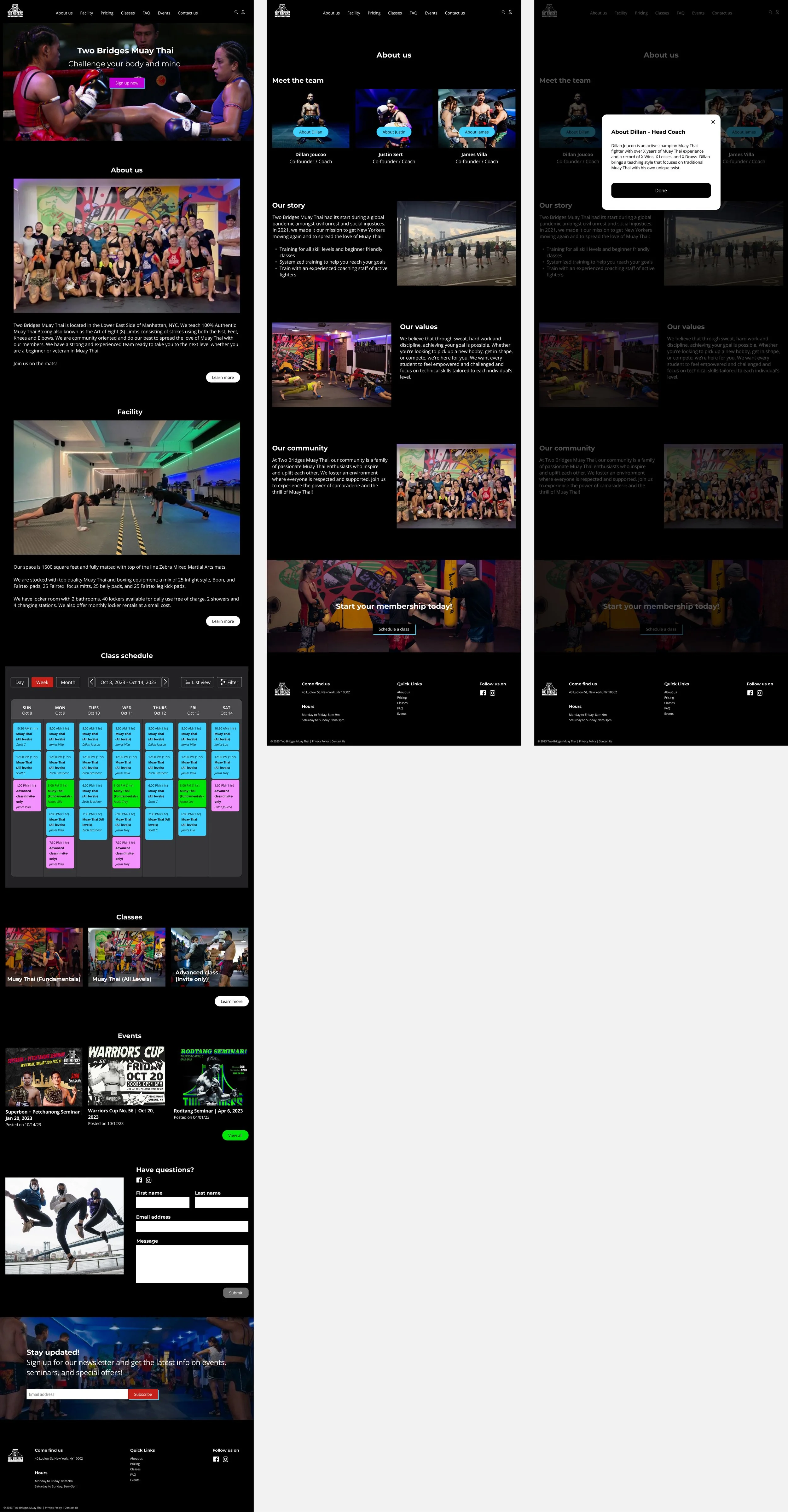
Presented below is a side-by-side snapshot view of the Desktop landing page from the original website and the redesign:
FINAL PROTOTYPES
Mobile
Desktop
8. CONCLUSION
NEXT STEPS
In the initial stages of the project, slow response from the business owners over email was a challenge. To keep the project moving, I took the initiative to complete a significant portion of the design independently. We’re now working together closely to refine the design through further iterations.
REFLECTION
I'm really happy with how the website turned out. While I think that getting the client's input earlier could have shaped the direction a bit differently, the main goal was to make the site more user-friendly. I did this by rearranging the existing content, and adding some extra details where it helped. Visually, I gave the site a refresh with a new color scheme that blends the original colors with some new ones.
Here are my big takeaways from this project:
Early client involvement is key: Getting the client on board early helps everyone work together smoothly. Having access to assets such as logos and images right away would have streamlined the progress of the work.
Building trust matters: Being a member of the gym myself definitely helped me connect with the owners and communicate effectively during the project.
Flexibility is a must: When working with clients, designers will have to compromise and prioritize the client’s vision over their own. This project reminded me of the importance of finding that sweet spot between expressing my creativity and meeting the client's needs.


